

Time-series viewer
GENNECT polled data refers to the measurement data acquired from a variety of instruments.
The time-series viewer function can combine the resulting diverse range of measurement data into a single graph.
Past data stored on the cloud server can be easily displayed as a graph. Compare it with the current data to understand the changes.
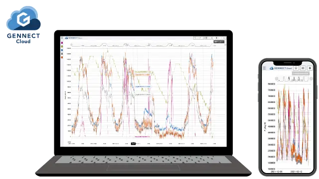
Create graphs of the data being measured by the monitor function and the past data stored on the drive.
Create graphs using the GENNECT polled data that is currently being measured by the monitor function. The graph can be automatically updated every minute, providing a visual representation of the measurement data.
Create graphs from the past GENNECT polled data stored on the drive.
Compare the graphs to better comprehend your data.
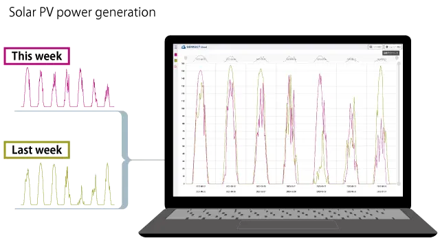
For example, you might want to compare the trend of power generated by the solar PV system this week to the previous week. In this case, the comparison graph display function is handy.
Two overlapping graphs are displayed on a single time axis, allowing comparison of power generation trends.
Specifications
| Graph display | Display a graph of GENNECT polled data or camera images
|
|---|---|
| Data Comparison display | Combines the time axis of two measurement channels and displays them on a single graph.
|
| List display | Display the GENNECT polled data values in a table
|
| Period | 1 hr. (automatic display updates) / 1 day / 1 week / 1 month / 1 year / user-defined period |
| Aggregating data |
|
Operation